Nature inspired colour collection based on industry colour trends 2025 predictions
Selected by our team
Colour trends 2025. The design world is shifting towards colour themes that connect us more deeply to the natural world. This 2025 colour palette offers a harmonious blend of hues inspired by the purity of water, the tranquillity of untouched landscapes, and the profound beauty of nature.
To help you use these colours in your home our team have scanned thousands of colours and products on our website to give you the perfect colour palette to reflect this trending tribute. All you have to do is pick two or three you like.
How to use this nature inspired palette
To incorporate this palette into your home or workspace, start by choosing a dominant shade from the collection, such as a deep blue or a soft green. Use this as the base colour for walls or large furniture pieces. Then, layer in complementary hues, like lighter blues or greenish-greys, through accents such as cushions, rugs, and artwork.
For a truly nature-inspired aesthetic, pair colours with natural textures. Think jute rugs, wooden furniture, and linen curtains. Indoor plants can also enhance the palette, bringing in an extra touch of vitality and reinforcing the theme of connection to nature.
The emotional impact of these colours
This palette isn’t just about aesthetics; it’s about how these colours make us feel. Blues and greens are scientifically proven to reduce stress and promote relaxation, making them perfect for creating spaces that nurture mental well-being. As we navigate the demands of modern life, this palette offers a much-needed antidote—a reminder to slow down, breathe, and reconnect with the natural world.
Looking ahead – Colour Trends 2025
This Colour Trend Palette for 2025 is a timeless homage to Earth’s beauty. By embracing these colours, we not only bring a touch of nature into our lives but also align ourselves with a broader cultural movement towards sustainability and harmony. This is more than a design trend; it’s a call to celebrate and protect the world we call home, hence our choices of paint are mostly environmentally friendly with super low VOCs.
Our paint choices
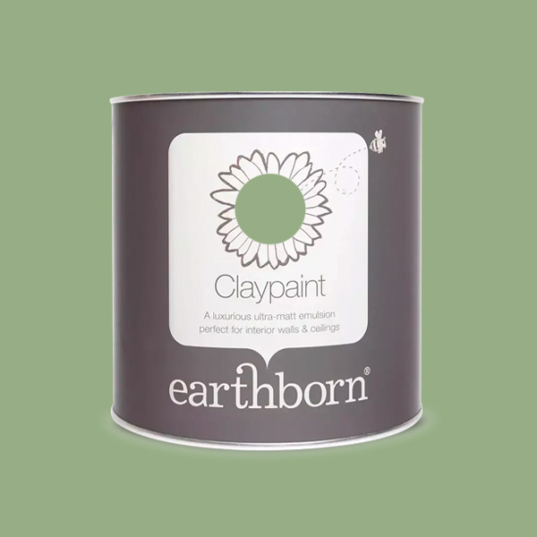
- Earthborn Claypaint: Cricket. A clean summer yellow based green. A luxurious, clay-based emulsion paint. Exceptional breathability – can benefit allergy and asthma sufferers. Eco friendly. Virtually V.O.C free.
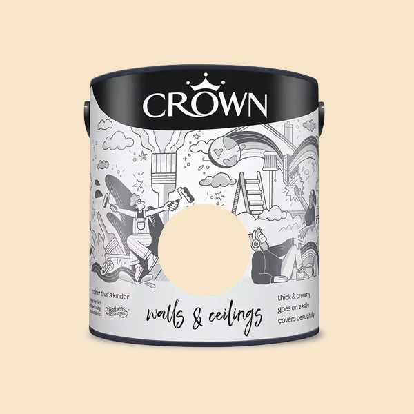
- Crown Walls & Ceilings Matt Emulsion: Soft Cream. A buttery rich warm cream. An asthma and allergy friendly matt emulsion paint. Dries to a tough, durable matt finish. 99% Solvent-free.
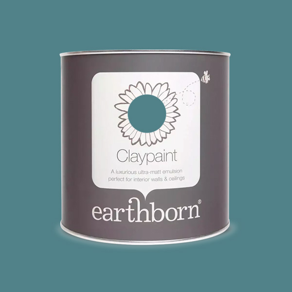
- Earthborn Claypaint: Bobble Hat. A rich lagoon cool toned blue with a touch of teal. A luxurious ultra-matt emulsion clay paint. Virtually V.O.C free. Exceptional breathability – can benefit allergy and asthma sufferers.
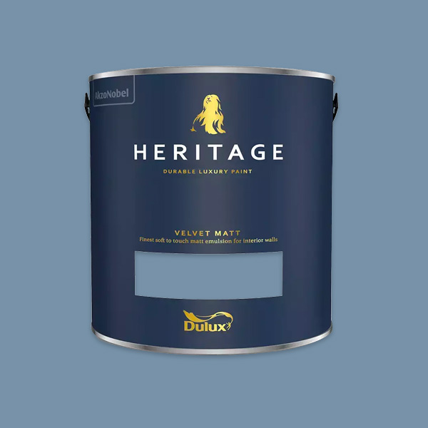
- Dulux Heritage Velvet Matt: Boathouse Blue. A cool toned blue soft enough to live with. High-quality pigments. Soft-to-touch, water-based emulsion. A hard-wearing, washable finish.
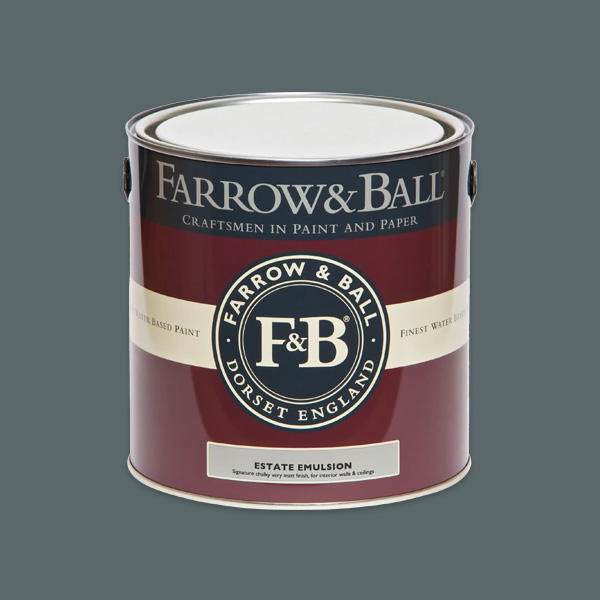
- Farrow and Ball Estate Emulsion: Inchyra Blue. A moody grey based blue with a hint of green.. This is a classic choice for low-traffic areas. Chalky, very matt finish. A+ rating for indoor air quality.
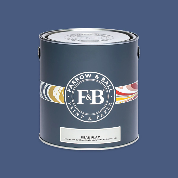
- Farrow & Ball Dead Flat: Dinnerware No. 9829. Clean blue bright in character and reminiscent of vintage china. A durable, multi-surface paint with an ultra-matt finish. Water based. Trace VOC. Washable and wipeable.
Check out the rest of our paint brands here
Subscribe to our mailing list and keep up to date with trends, offers and competitions here
